Climate Matters•May 13, 2020
Travel and Air Pollution During COVID-19
KEY CONCEPTS
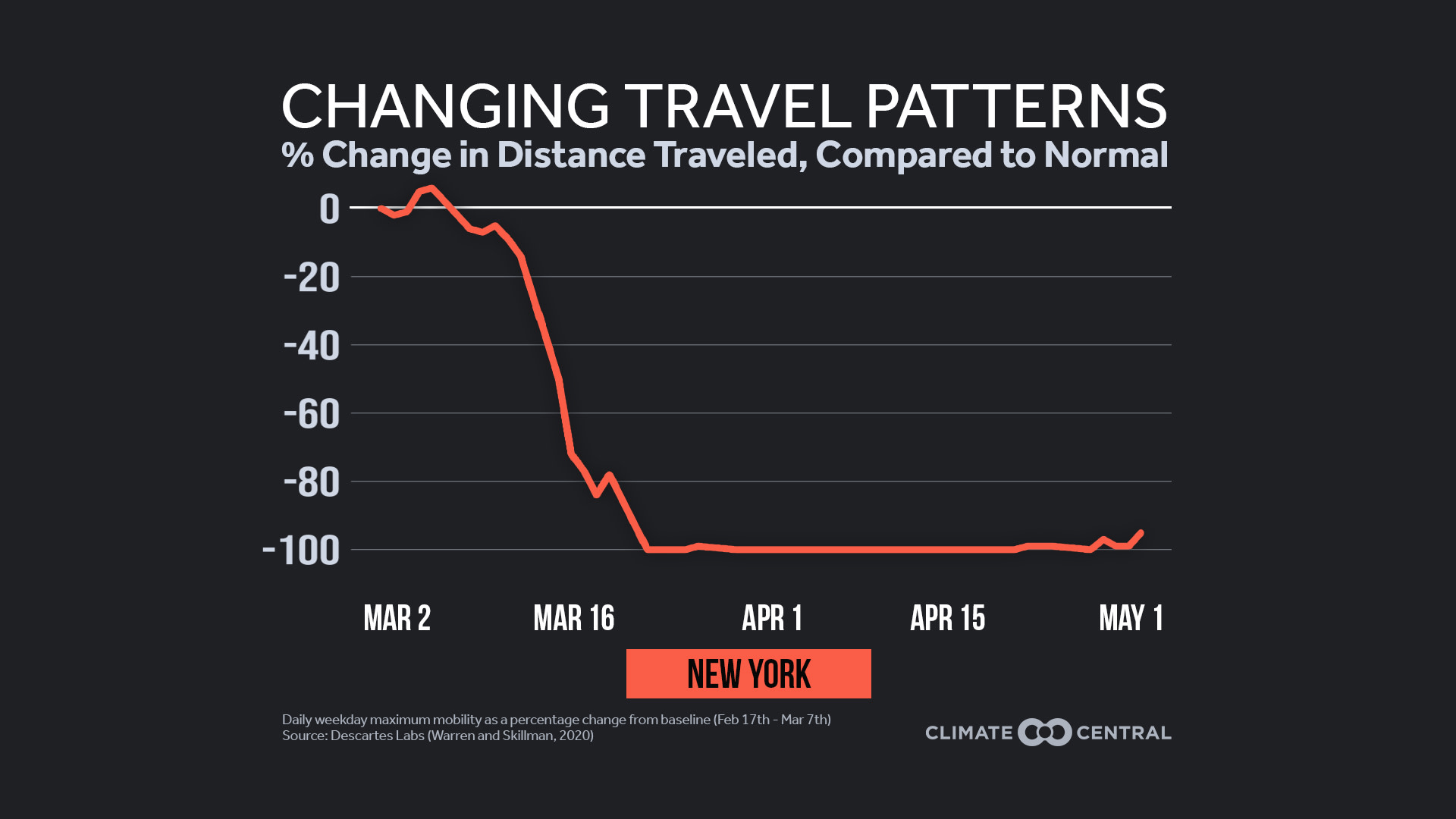
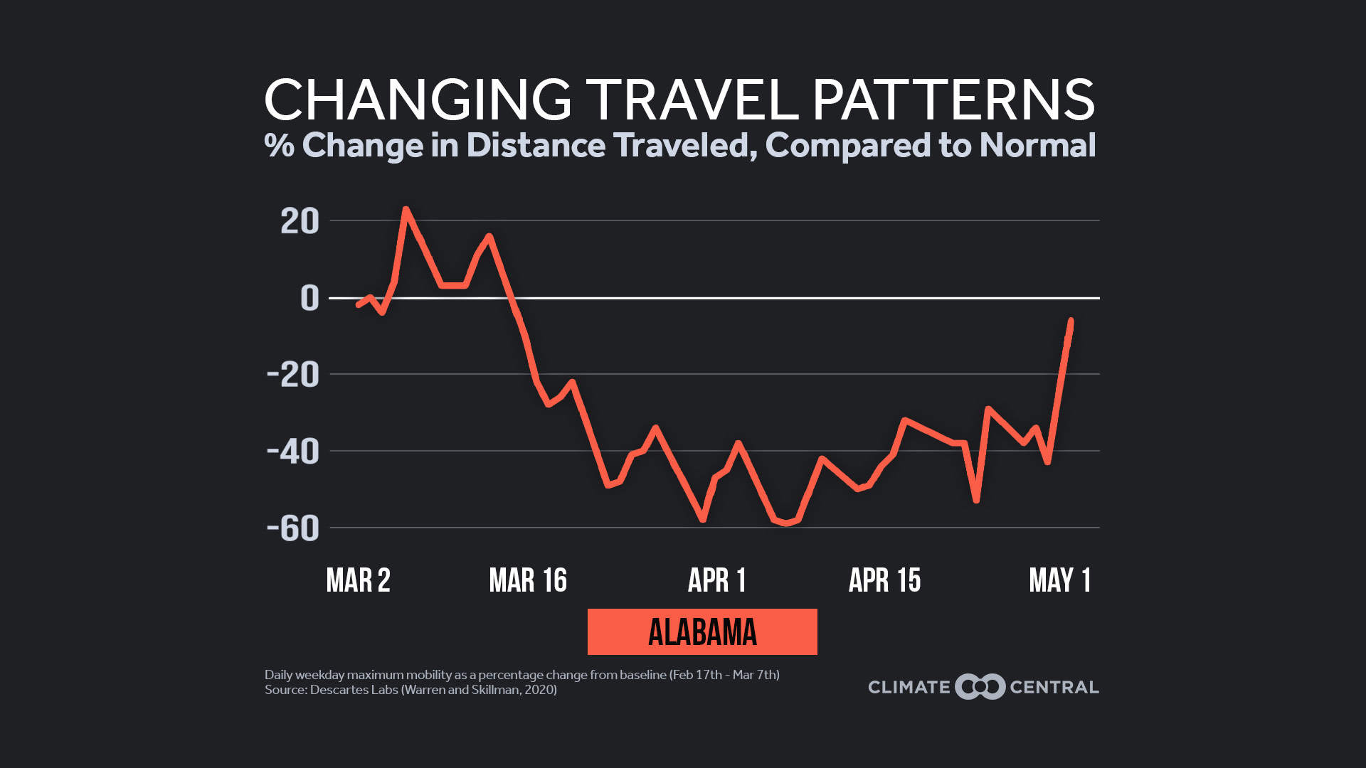
The sudden drop in travel during COVID-19 is causing major improvements in short-term air quality. We track these changing travel patterns using daily mobility data from Descartes Labs.
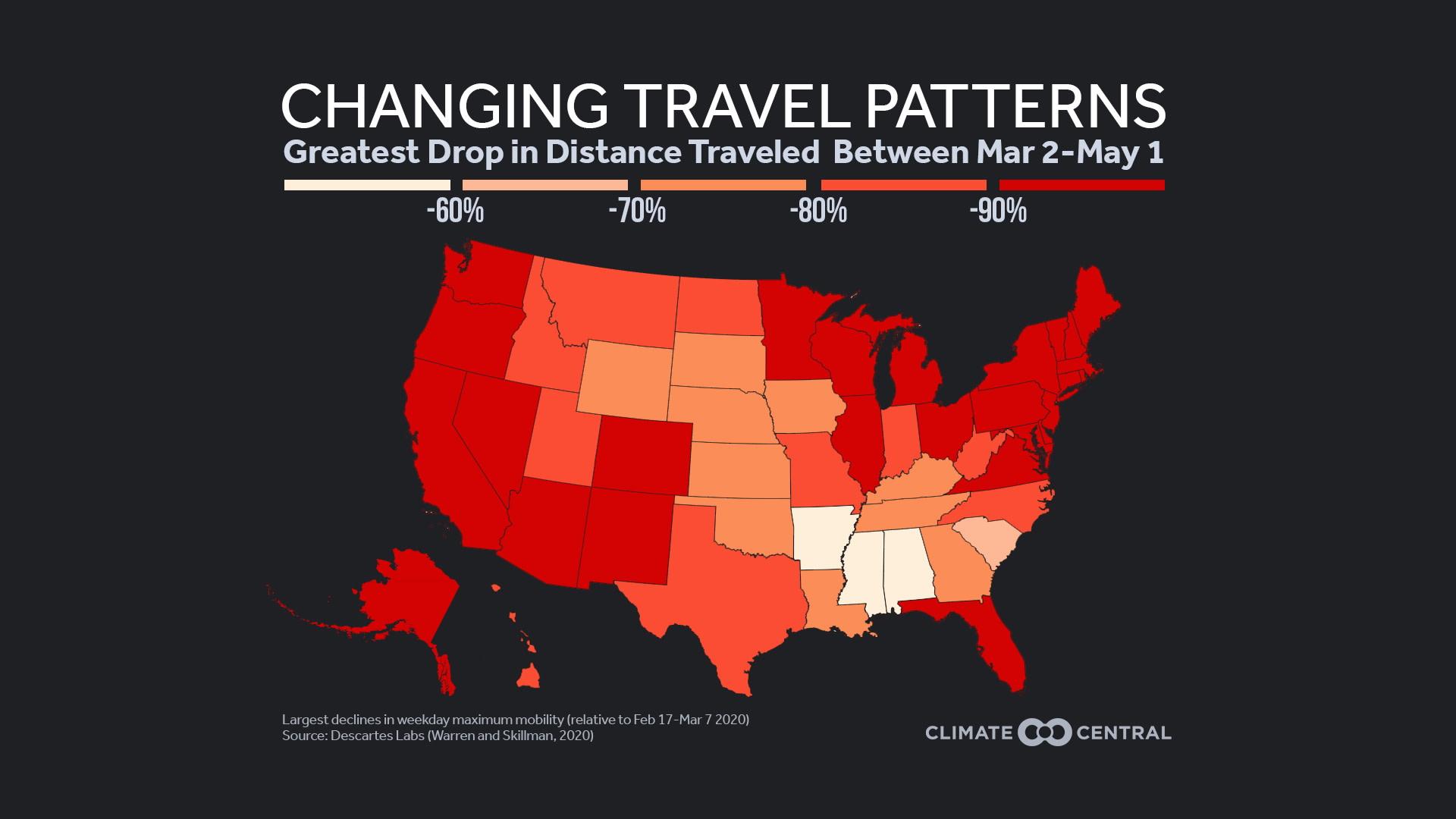
In March and April, all 50 states saw mobility drop by more than half at some point, relative to a pre-pandemic levels. In 26 states, this maximum decrease was more than 90%.
As travel plummeted, March NO2 levels fell about 30% in the Northeast and 40% in the Southeast, relative to a 2015-2019 baseline. (Stay tuned for other regional before-and-after maps as NASA releases them). NO2 is one of the smog-forming NOx pollutants, and more than half of their emissions come from transportation.
Many of these changes won’t last, as travel rebounds and hotter, sunnier days lead to more smog. But today’s cleaner skies show what lower emissions can do for our health and quality of life.
READY-TO-USE GRAPHICS
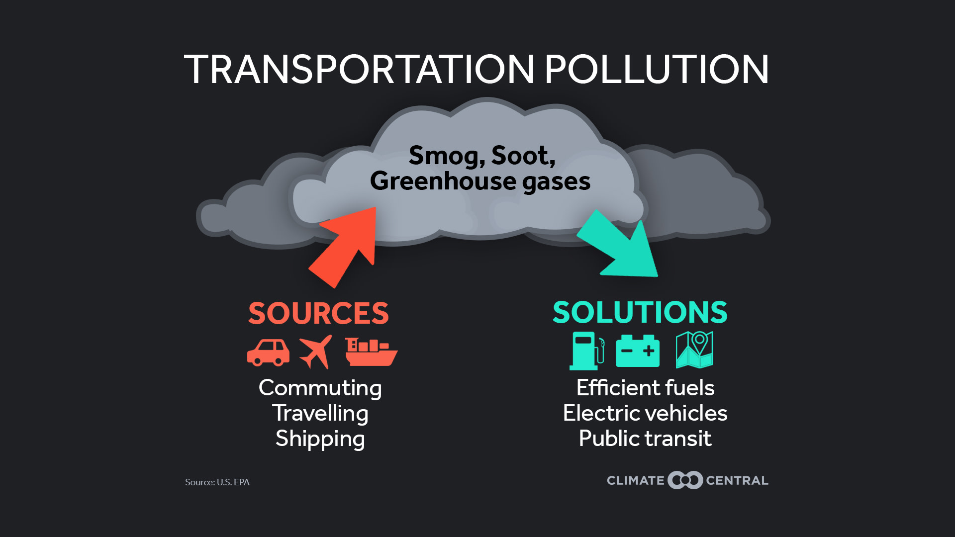
Sources and Solutions for Transportation Pollution
Find All Versions of Image Here
(JPG & PNG)
With the shutdowns of COVID-19, it’s clear that people are traveling less. Vehicle miles fell by more than 60% from early March to mid-April, and demand for flights has been close to zero. But what does this mean for climate change? Last week, we showed that even an unprecedented one-year drop in greenhouse gas emissions won’t halt the rise of long-lasting CO2 in the atmosphere. Short-term air pollutants (which are gone in months, not centuries) are a different story—as seen in recent clean air revelations from India to California. This week, we discuss how ground travel and air pollution are changing locally, and what might happen in the long-term.
One way to track travel involves our cell phones—which record the maximum daily distance from their initial location. Descartes Labs has aggregated this daily mobility data since March 1st (excluding weekends), and the results are striking. All 50 states saw mobility drop by more than half at some point, relative to a pre-pandemic baseline. In 26 states, the maximum decrease was more than 90%. However, mobility has started to rise again in some places, most noticeably the Southeast and Great Plains.
Transportation accounts for 28% of U.S. greenhouse gas emissions, and it has a major impact on local air quality. Cars, trucks, and shipping emit more than half of the nation’s NOx, a group of smog-forming pollutants led by nitrogen dioxide (NO2). Air pollutants have harmful and unequal health effects, from asthma and breathing problems to increased risk of infection during the pandemic itself. But as travel plummeted, March NO2 levels fell about 30% in the Northeast and 40% in the Southeast, relative to a 2015-2019 baseline. (Stay tuned for other regional before-and-after maps as NASA releases them).
The cleaner air may not last, as recent mobility trends suggest. Additionally, hotter and sunnier days lead to more air stagnation and ground-level ozone formation, as seen in Los Angeles already. Above all, today’s cleaner skies are a reminder of what lower emissions can do for our health and quality of life.
POTENTIAL LOCAL STORY ANGLES
How are travel patterns changing where you live?
Descartes Labs includes daily mobility data at the county level, and Google offers other metrics by state as well as many counties. Special Report 3: Impact of COVID19 Mitigation on Traffic by the Road Ecology Center at UC Davis shows the reduction in vehicle miles traveled (VMT) by state between the first week of March and the second week of April. You can find the VMT difference by county in this interactive map from StreetlightData.
How is this affecting local air quality?
See if your region is included in NASA’s recent air quality maps, and stay tuned for additional regions. You can also plot recent data from the EPA’s Air Quality System (though some areas may have lags in their vetted data).
How does air quality generally affect local health?
The Medical Consortium on Climate and Health is a great resource for connecting health and climate change. And for past years of data, check out city rankings and more in the American Lung Association’s 2020 State of the Air Report, released on April 21. The ALA (media@lung.org) could help you identify local pulmonologists and allergists to explain how air pollution affects people in your community.
LOCAL INTERVIEW IDEAS
Each state’s environmental and health agency is listed at this EPA site. You can also consult the Association of Air Pollution Control Agencies, which is made up of staff from state and local agencies that monitor and regulate air quality.
The SciLine service,500 Women Scientists or the press offices of local universities may be able to connect you with local scientists who have expertise on changing air quality in your area. The American Association of State Climatologists is a professional scientific organization composed of all 50 state climatologists.
NATIONAL EXPERTS
Jennifer Brady — Senior Data Analyst, Climate Central, jbrady@climatecentral.org
Bryan Duncan — Research Scientist, Atmospheric Chemistry and Dynamics Laboratory, NASA Goddard Space Flight Center, bryan.n.duncan@nasa.gov
Ryan Stauffer — Meteorologist and Visiting Assistant Research Scientist, Earth System Science Interdisciplinary Center, NASA Goddard Space Flight Center, ryan.m.stauffer@nasa.gov
Ana Prados — Program Manager, NASA Applied Remote Sensing Training, NASA Goddard Space Flight Center, aprados@umbc.edu
*Available for interviews in Spanish and English
METHODOLOGY
Maximum mobility data from March 1st to May 1st was obtained from Descartes Labs. The percent change in mobility for weekdays was analysed relative to a 3-week baseline (February 17th to March 7th) for each state and Washington, DC. The national map illustrates the maximum change in mobility over the study period. Full methodology can be found in Warren and Skillman (2020). The linked NASA images show satellite data of NO2 from the Ozone Monitoring Instrument (OMI) on NASA’s Aura satellite.